Grand Central Terminal
Creating a bold new look and positioning for New York’s most beloved crossroads.
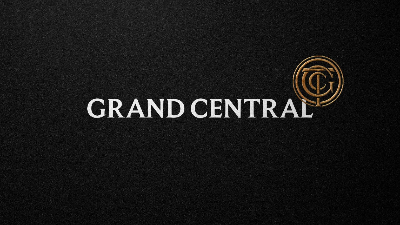
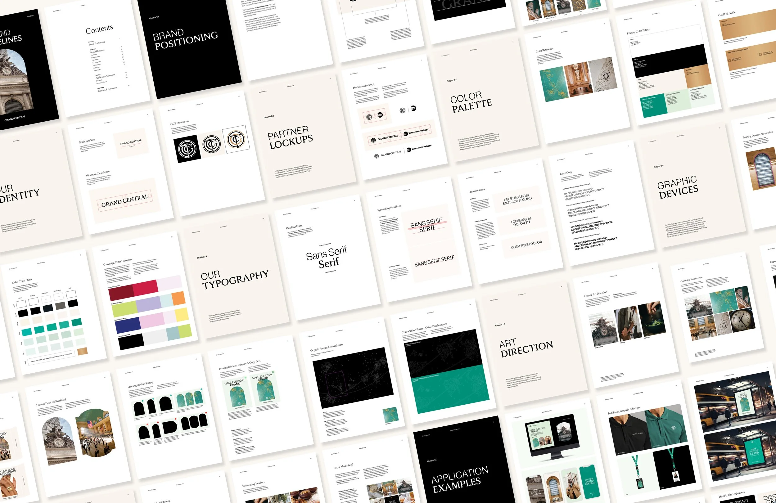
Grand Central Terminal engaged Resonance to reimagine its brand and positioning, with the goal of modernizing the identity, unifying messaging across stakeholders, and reframing the Terminal as an accessible, culturally relevant destination for New Yorkers and visitors alike. As the brand designer on the project, the work focused on translating this strategic shift into a cohesive and flexible visual system.
Services
Art Direction
Brand Identity Refresh
Brand Positioning
Stationery Design
Marketing Strategy
Team
Creative Director: Dominic Prevost
Associate Creative Director: Anthony Hore
Copywriter: Dianna Carr
Art Direction & Design: Kelsey Boucher
Production Designers: Shannon Leung, Davor Katinic
Designed at Resonance Consultancy
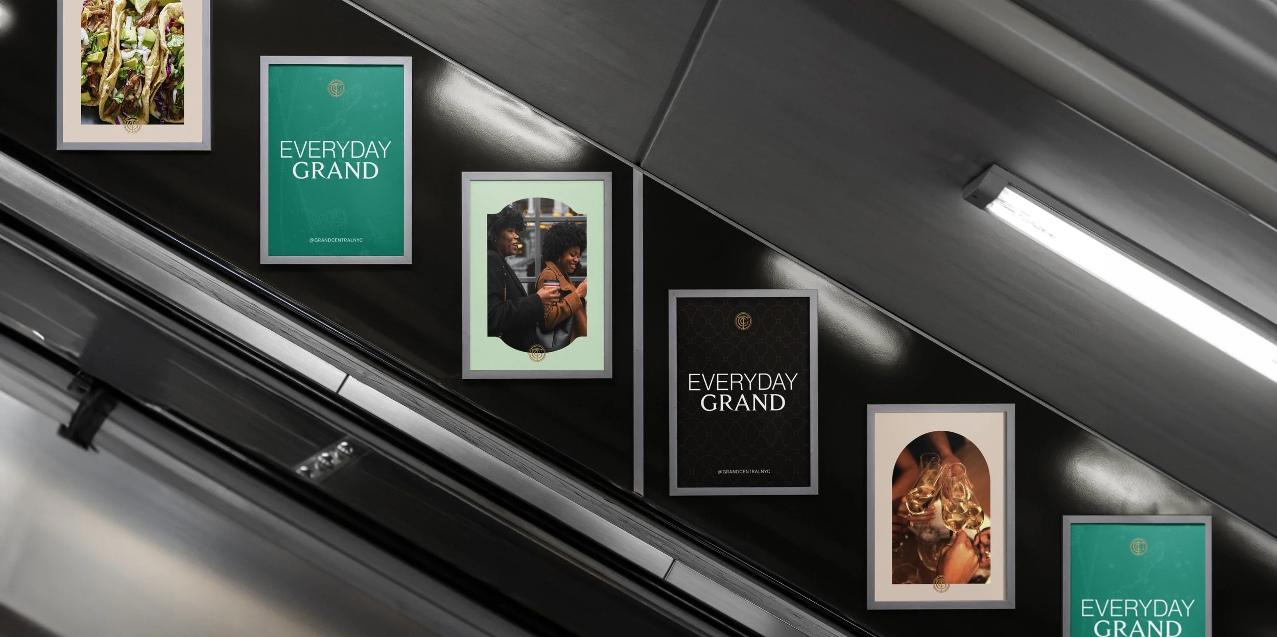
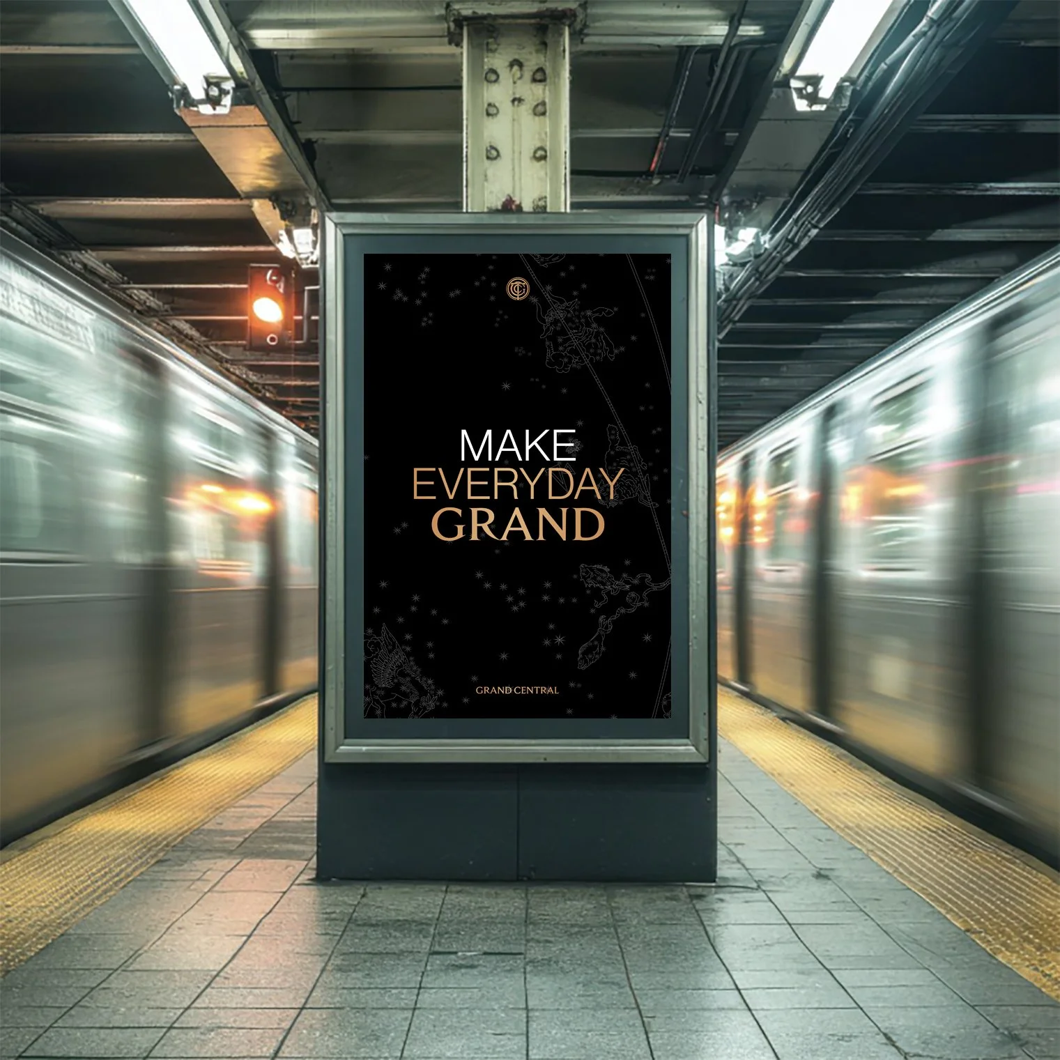
The repositioning moved Grand Central away from the exclusivity implied by “Only at GCT” toward a more inclusive and functional point of view—one rooted in convenience, relevance, and everyday utility. This shift was articulated as Everyday Grand: “Everyday” capturing the Terminal’s role as New York at your service, and “Grand” honoring its history, beauty, and legacy as one of the city’s great civic spaces.

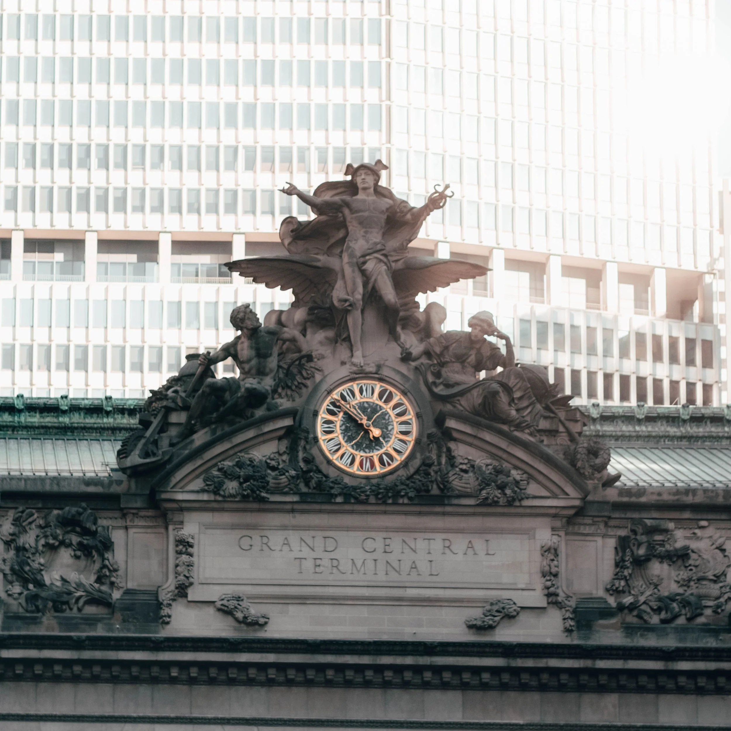
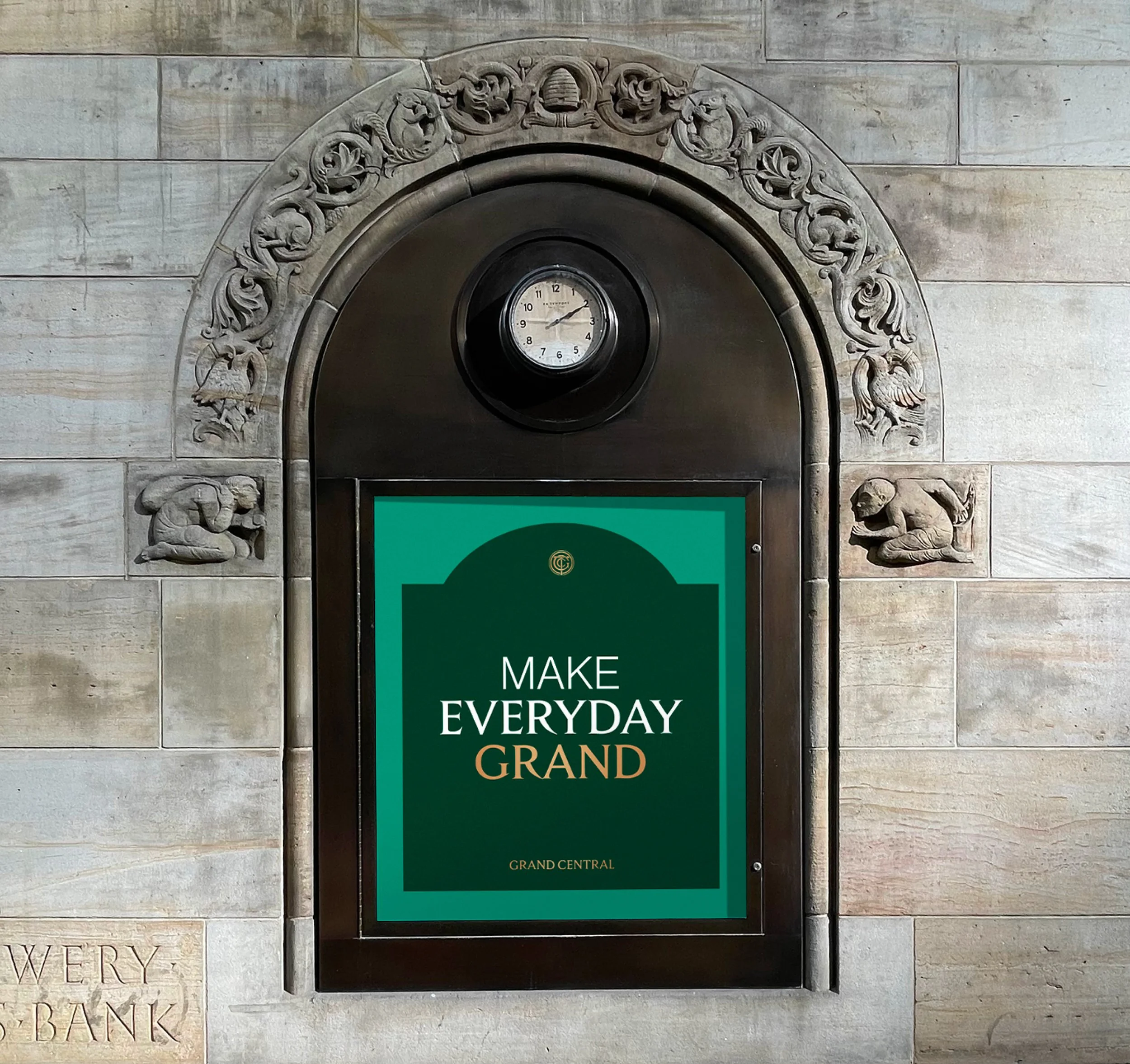
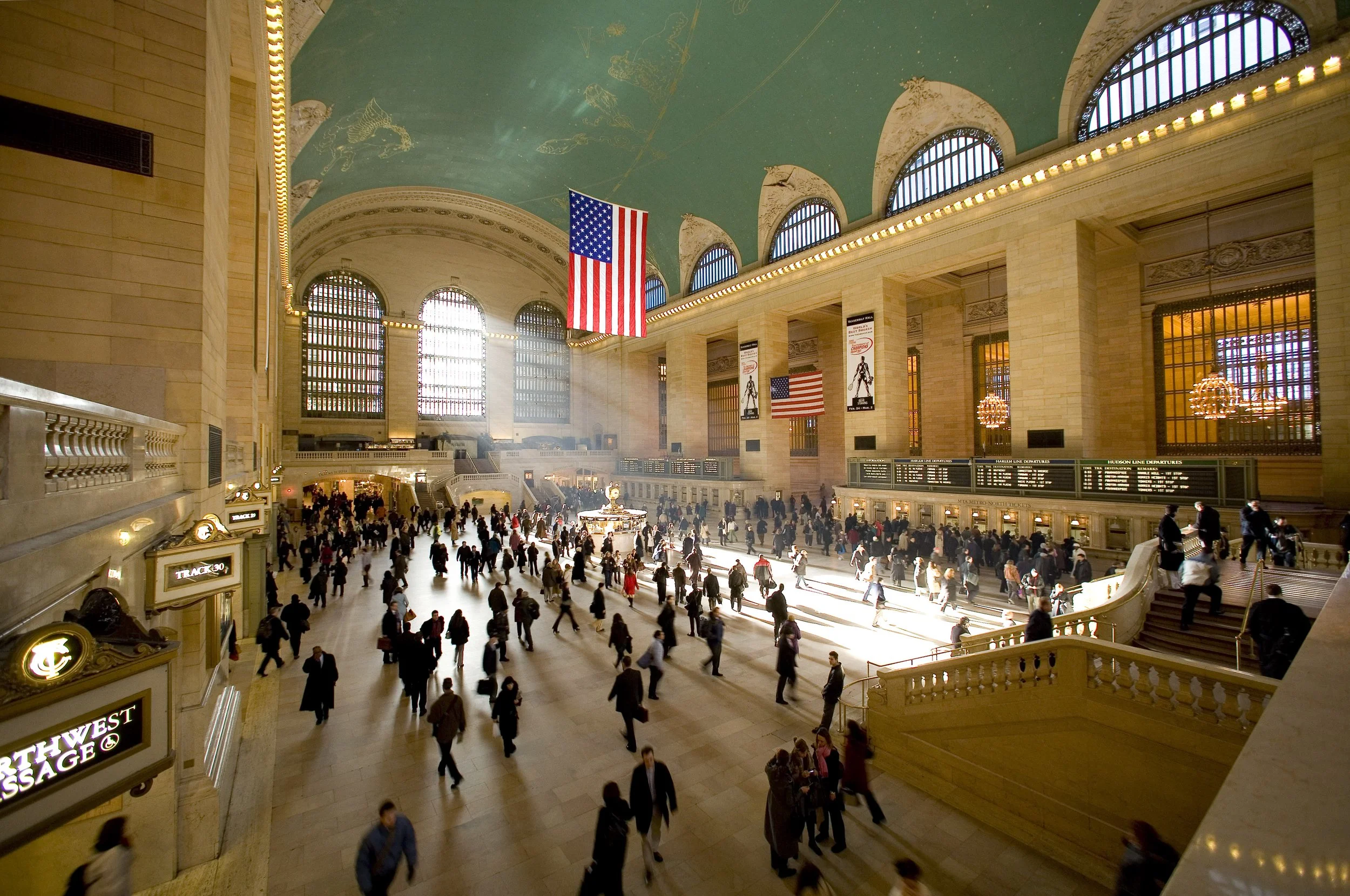
The refreshed identity draws directly from the Terminal’s architectural grandeur. Graphic frames, patterns, and typographic elements were designed using cues from the Constellation ceiling, Beaux-Arts wall motifs, and ornamental details throughout the building. These elements were abstracted and reinterpreted to form a modern visual language that feels native to the space rather than imposed upon it. The result is an identity system that elevates daily experience while remaining flexible enough to support a wide range of messaging and applications.

Holiday Fair Brand Identity
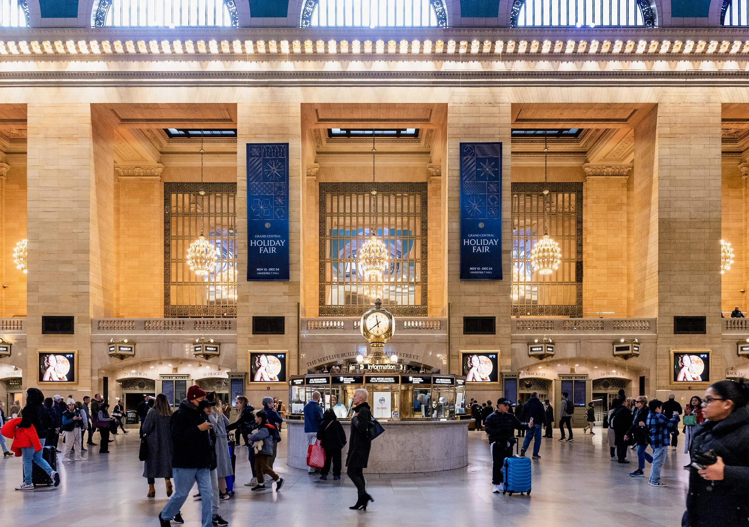
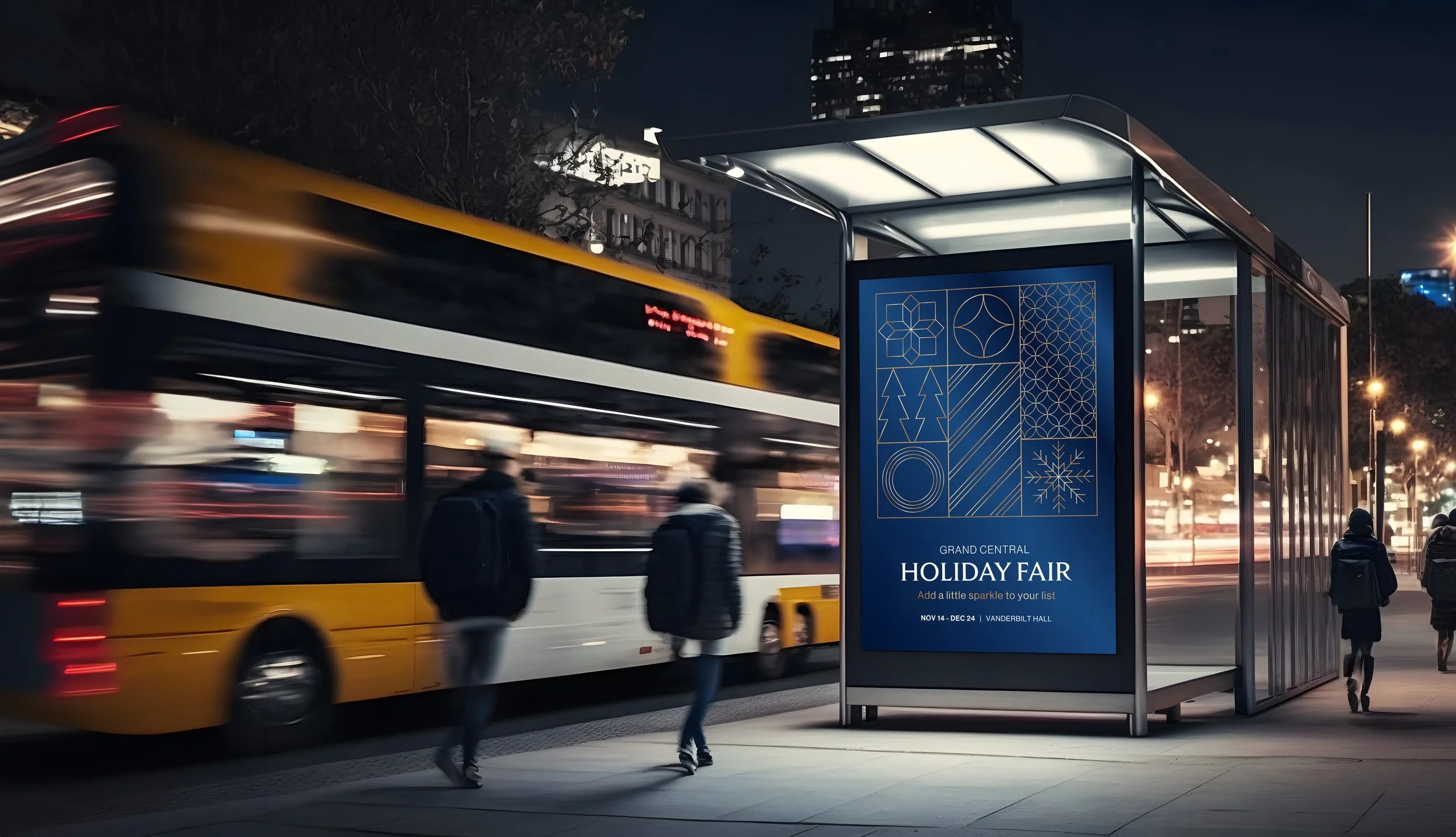
In addition to the core brand refresh, a new visual concept was developed for the Grand Central Holiday Fair in 2023. The brief called for a campaign identity that was elevated yet approachable, distinctly Grand Central without being overly literal, and capable of living across print, digital, and environmental applications while coexisting with the Terminal’s architecture. The solution centered on a modular, architecturally inspired graphic system drawn from the Constellation ceiling and the Terminal’s ornamental metalwork. The resulting visual language was designed to feel collectible and ownable—something visitors might want to take home, wear, or gift—while establishing a sense of provenance and romance unique to Grand Central.
Together, the refreshed brand identity and campaign work helped reposition Grand Central Terminal as a place where the everyday and the extraordinary intersect, reinforcing its role as both a functional transit hub and a cultural destination.